

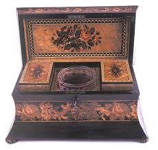

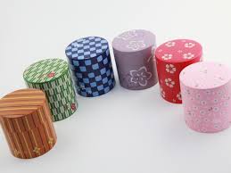


 this is my research. some of these tea boxes are pretty. some boxes cool. yeep yeep yeep.
Month: April 2015
The Principles of design

is the appearance or condition of oneness. In design, unitydescribes the feeling that all the elements in a work belong together and make up a coherent and harmonious whole. When a work of art hasunity, we feel that any change would diminish its quality. Variety, on the other hand, provides diversity.

Repetition refers to one object or shape repeated; pattern is a combination of elements or shapes repeated in a recurring and regular arrangement; rhythm–is a combination of elements repeated, but with variations.

Harmony in design is the visually satisfying effect of combining similar, related elements. eg. adjacent colors on the color wheel, similar shapes etc.

Gradation of size and direction produce linear perspective. Gradation of of colour from warm to cool and tone from dark to light produce aerial perspective. Gradation can add interest and movement to a shape. A gradation from dark to light will cause the eye to move along a shape.

Contrast is the juxtaposition of opposing elements eg. opposite colours on the colour wheel – red / green, blue / orange etc. Contrast in tone or value – light / dark. Contrast in direction – horizontal / vertical.
The major contrast in a painting should be located at the center of interest. Too much contrast scattered throughout a painting can destroy unity and make a work difficult to look at. Unless a feeling of chaos and confusion are what you are seeking, it is a good idea to carefully consider where to place your areas of maximum contrast.

refers to the sense of distribution of perceived visual weights that offset one another. We feel more comfortable–and therefore find it more pleasing–when the parts of an artwork seem to balance each other.

Dominance in a piece of art means that an object or color stands out in relation to the painting, picture, etc. colors that contrast or large objects tend to dominate the picture, and therefore is what your eye is naturally drawn to. An example would be a yellow square surrounded by a larger purple square.
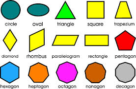
elements of design


definitions
pin buttons


![]()


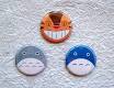
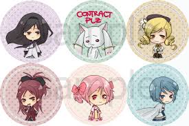
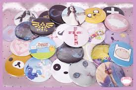
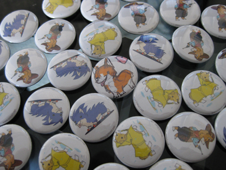 these are buttons. there cool. i like the anime ones. the link one and the adventure time ones are my favorite ones.
notepad
 yep.
yep.
